Building a DTC Sleep Brand – On a Pillow
A Pillow 50 Years in the Making

The Strategic Roadmap
The Graphos Product strategy team got to work researching the intricacies of the highly competitive, rapidly evolving sleep industry. While the market had seen a number of astonishing success stories, explosive growth in competition had led many innovative DTC brands to struggle. We assembled an Innovative Product Go-to-Market Roadmap™ that considered the reasons why consumers sought top-quality pillows, and identified gaps in what existing options offered. Our research identified that consumers were often confused by the number of pillow options and baffled by the complexity of what should be a quick and simple purchase.
What made the Parallel Pillow different was not any one of its amazing features, but everything about it. Choosing a Parallel Pillow was a breeze with just a few considerations to ensure it’s the perfect match for every sleeper type.
The Positioning: World’s Kindest Sleep Company
The Parallel Pillow would encapsulate the entire company’s philosophy and purpose, in one flagship product. The pillow would be kind to the consumer, providing a ridiculously easy buying process and a delightful, rejuvenating sleep. It would be kind to the environment, with a sustainably made TENCEL™ outer cover, a plant-based memory foam and a down-like fluff made from up to 23 up-cycled water bottles per pillow. And it would be kind to other people, donating one pillow to a person in need for every pillow sold.

A Name & Logo Crafted to Scale
The new company had a lot of substance — and was even in the process of importing factory equipment from Europe — but was missing a name.
We activated our proven brand name development process, and built a list of strong contenders that met the client’s criteria. An early favorite was one that connoted the way a sleeper’s nighttime experience is reflected throughout the following day. The name Parallel enabled many wordplay applications through congruencies and dichotomies, and would be reflected in the High Profile pillow’s parallel piping and the outer cover’s elegant stitch pattern.
Our branding team also leaned into the newly selected name in creating the logo, incorporating many literally parallel features into the handcrafted typeface, along with beautiful visual symmetry and a delightful easter egg: a golden crescent moon embedded in the uppercase “P.”
An Unconventional Feel, for Memorable Branding
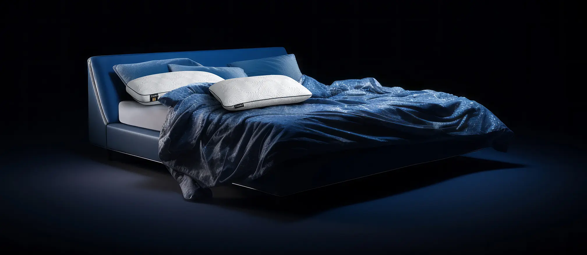
We noticed something particular about online stores in the sleep industry: they all sort of felt the same. All were light, bright and airy. They focused on morning and daytime. And while we recognized that daytime is important (which we reflected in the tagline, “Your Tomorrow Starts Tonight,” we also believed people should look forward to joining their amazing Parallel Pillow — at night. The branding came to include rich, dark blues and greens, evoking the pleasure and reward of going to bed. “It’s Almost Bedtime,” the messaging said. Users comparing sleep products would remember the soothing embrace of the Parallel store compared to all the lookalikes.
That visual differentiation would be essential to conveying how Parallel was unique.
A Full Suite of Parallel Materials
Launching a sleep brand throughout the United States would require much more than a website.
Parallel Sleep
Adoption & Growth
As the Parallel Pillow continued to catch on and impress consumers, we began to work on the innovative products that would come next.
This will include mattresses, sheets, bed frames and other sleep products — each as unique as the product that started it all.

